Research & Design


The Thinking Process
Research Interview
One of our team members interviewed their friend who is a freshman at SUSS to find out more about her needs, navigation experiences, frustrations and pain points navigating the SUSS campus. She voiced various frustrations regarding getting lost when stepping into the campus buildings. Signages use a numbered naming convention that might confuse people unfamiliar with this system.
Most signages lead to locations within the current campus building, while directions to another building are often obscure. There are no directions to many landmarks such as places to get supper before going to class. Our freshman noted that there is no direct lift to her classroom, and she had to switch to another lift lobby before getting there. There were no signages indicating this, and she was frustrated to the point of deciding if she should go home instead of attending class.


Organize Findings
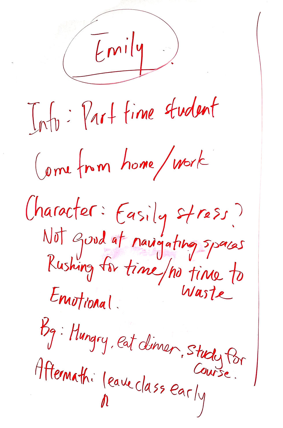
Based on an initial brainstorming and discussion session, we drafted our initial content for the poster in point form. We constructed a persona called “Emily” based on various descriptions of our freshman and questions to get to know her better. Her user journey starts from alighting from the bus at the bus stop at Block A, followed by grabbing a bite at the food court at Block B, and ends at her classroom on the 7th floor of Block C. Based on our team member’s interview and understanding of our freshman’s point of view, we came up with an empathy map illustrating what she says, thinks, does and feels, and also pain points and gain points. Each of us wrote down points we thought could be relevant on Post-It notes, then classified them under the relevant headers on a whiteboard.
Poster Elements & Structure
I came up with a grid layout to present these contents and ideas visually. It had 6 columns: Two columns for the persona, three columns for the journey map for which each column is a step in the journey, and one breather column. The chevron diagram leads the eye to read the persona first, then move on to each step in the journey map from left to right. Most Singaporeans would be familiar with the typeface I used, Rotis Sans, and they encounter it frequently. Even if they do not recall it immediately, Rotis Sans is strongly associated with wayfinding because everywhere in Singapore it is used in transport and street signages. I created the initial design in black and white as a low-fidelity prototype so that we can focus on the content and layout. Colours would be added later.
Iterate
The next draft removes unnecessary whitespace. In the previous draft, there is a lot of whitespace in between blocks of text and graphic elements. A lot of this whitespace is inefficient, does not serve a deliberate purpose, and can be removed for better space utilization. By improving space allocation, we can include more content, which the team was working on and introducing in subsequent meetings. The second draft experiments with using icons intended to communicate ideas better visually and facilitate understanding in a shorter time frame. It also adds two new sections to introduce the objectives and issues faced, and describe the solutions proposed.
For this draft, the team member who interviewed “Emily” wrote a more detailed version of her findings for us to work on. She knows “Emily” personally so it was convenient for her to follow up with questions to clarify or build on existing points from the initial interview. We have more information to work with, such as her age and what she does at work which makes her so irritable when reaching the SUSS campus. With more detailed information, we are able to list down and organize her pain points at each step of her journey, and suggest solutions for each pain point. The empathy map is now presented as a visual diagram of what the user thinks, feels, says and does. I added colours after determining that this is the layout that we will use. I used progressively lighter colour tints on the chevron diagrams to improve information hierarchy. Dashed lines were used to lead the eye across columns and down rows. Finally, I added a visual map of the SUSS campus to better represent the freshman’s journey from the bus stop to the classroom in real life.
This final version includes new copywriting paragraphs for the objectives of our study and an overview of issues faced by the user. The persona now includes a graphical representation of the user’s motivations. Finally, I added a background for a dimension of texture to the poster, breaking the monotony of flat white space, introducing intricate details that draw the viewer’s eye and encouraging them to explore the poster more thoroughly.
This poster condenses the findings from research conducted by the team into a graphical format. This design draws inspiration from kids’ science graphic books, which often present content-heavy material in an easily readable and understandable layout. The final poster contains significantly more information than the first draft within the same page area and selectively uses graphics to aid in understanding findings and ideas. Diagrams and maps help the reader visualize the freshman’s journey through the SUSS campus and better understand the problems and frustrations experienced.


